OpenZhenZhen AI 프롬프트 갤러리 · zhenzhen-image-g-v2.5-lowprice · image
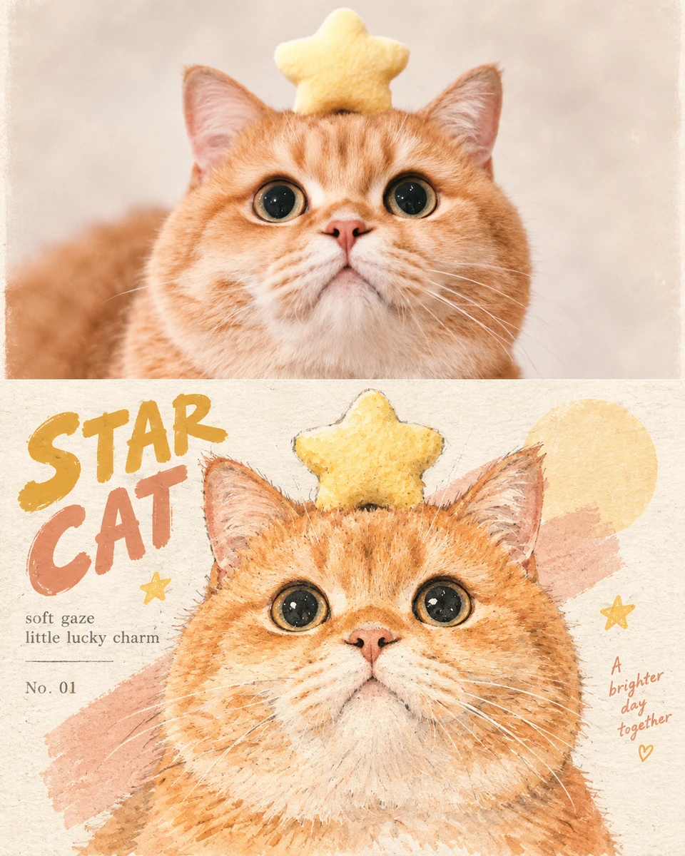
분할 일러스트 포스터
Split Illustration Poster
‘분할 일러스트 포스터’은(는) zhenzhen-image-g-v2.5-lowprice로 만든 작품입니다. OpenZhenZhen에서 원본 프롬프트와 생성 예시를 살펴보고 새로운 창작에 활용해 보세요.
프롬프트
중국어 프롬프트
创作一张竖版"上下双拼"风格海报,画布严格划分为上下两个区域,上方为真实摄影原图,下方为同一主体的复古水彩手绘编辑插画转译。整体气质轻松、俏皮、温柔、时髦、复古且带少量幽默感。 上半部分: 放置用户上传的原始照片。以人物、宠物、动物,或人物与宠物之间的关系作为画面主体,清楚呈现主体的脸部特征、发型、毛色、服饰、动作、姿态和整体氛围。上半部分保留真实摄影风格,不做插画化处理,可适度裁切以增强主体聚焦。背景尽量克制,建筑和复杂空间只作为弱化环境,不作为主要内容。 下半部分: 从上半部分照片中提取最具识别性的主体、轮廓、姿态与叙事关系,重构为轻盈、稚拙、复古的手绘编辑插画。不要机械复刻细节,以概括造型、适度夸张比例、符号化特征和幽默视觉隐喻重新表达,同时保持原物一眼可辨。融合现代主义编辑插画、包豪斯平面构成、儿童绘本、稚拙艺术与时尚速写气质,形体简练,轮廓略带迟疑与手工误差,局部特征可适度放大,让画面兼具故事感、时尚感与俏皮感。 配色从上传的原图中提取,采用高明度、低至中等饱和度的柔和有限色盘,以近似色统一氛围,小面积互补色制造视觉跳点。使用水彩、水粉、彩铅、粉蜡笔与干刷混合质感,保留纸张颗粒、透底、笔触断裂、边缘毛糙、轻微脏色与旧印刷套色偏差。背景大面积留白,仅以松散淡彩、局部斜线或简单几何元素承托主体,避免复杂场景堆积、写实光影、光滑矢量、三维渲染和过度精修。 文字从照片的地点、人物、场景或主题中提炼少量英文关键词、标题、编号或适配金句,并延续画面的手绘编辑语言。主标题采用略带稚拙与复古感的手写艺术字,辅助文字使用克制温和的无衬线或衬线字体,可轻微错位、倾斜、拉伸、叠色或产生旧印刷套色偏移,让文字像插画的一部分自然生长在画面中,而不是后期贴上的排版元素。 整体使用米白或浅色背景与大量留白,主体特征、色彩、姿态与视觉符号在画面中保持统一呼应。整体气质轻松、俏皮、复古、温柔、聪明、时髦、幽默、浪漫、松弛,略带笨拙与古怪自信,像一页被精心保存的旧时尚绘本与现代艺术杂志。 整体需清晰传达"上半部分为原始照片参考,下半部分为同一主体的复古水彩编辑插画转译",二者之间既有身份一致性,也有明显风格落差。
영어 프롬프트
Create a vertical "split top-and-bottom" style poster, with the canvas strictly divided into two areas: the upper part is the original real photograph, and the lower part is a retro watercolor hand-drawn editorial illustration reinterpretation of the same subject. The overall temperament is relaxed, playful, gentle, stylish, vintage, with a touch of humor. Upper half: Place the original photo uploaded by the user. Use a person, pet, animal, or the relationship between a person and a pet as the main subject of the image, clearly presenting the subject's facial features, hairstyle, fur color, clothing, action, pose, and overall atmosphere. The upper half retains a real photographic style without illustration-style processing, and may be moderately cropped to enhance focus on the subject. Keep the background as restrained as possible; buildings and complex spaces should only serve as a weakened environment, not as the main content. Lower half: Extract the most recognizable subject, silhouette, pose, and narrative relationship from the upper photo, and reconstruct them into a light, naive, retro hand-drawn editorial illustration. Do not mechanically replicate details; instead, re-express through simplified forms, moderately exaggerated proportions, symbolic features, and humorous visual metaphors, while keeping the original subject recognizable at a glance. Blend modernist editorial illustration, Bauhaus graphic composition, children's picture books, naive art, and fashion sketch qualities. Forms are concise, contours carry slight hesitation and handmade error, and certain local features may be moderately enlarged, giving the image both narrative feel, fashion sense, and playfulness. The color palette is extracted from the uploaded original image, using a soft, limited palette of high brightness and low to medium saturation, unifying the atmosphere with analogous colors, and using small areas of complementary colors to create visual accents. Use mixed textures of watercolor, gouache, colored pencil, pastel, and dry brush, preserving paper grain, transparency, broken brushstrokes, rough edges, slight muddiness, and minor old-print color registration shifts. Leave large areas of blank space in the background, supporting the subject only with loose pale washes, local diagonal lines, or simple geometric elements, avoiding complex scene accumulation, realistic lighting and shadow, smooth vectors, 3D rendering, and excessive retouching. Extract a small number of English keywords, titles, numbers, or suitable aphorisms from the photo's location, people, scene, or theme, and continue the hand-drawn editorial language of the image. The main title uses handwritten art lettering with a slightly naive and retro feel, while secondary text uses restrained and gentle sans-serif or serif fonts, which may be slightly offset, tilted, stretched, overprinted, or have old-print color registration shifts, so that the text naturally grows as part of the illustration rather than appearing as a typographic element pasted on afterward. Overall, use an off-white or light-colored background with plenty of negative space, and maintain unified resonance among the subject's features, colors, pose, and visual symbols. The overall temperament is relaxed, playful, retro, gentle, clever, stylish, humorous, romantic, loose, with a slight awkwardness and quirky confidence, like a carefully preserved page from an old fashion picture book and a modern art magazine. Overall, it must clearly convey that "the upper part is the original photo reference, and the lower part is a retro watercolor editorial illustration reinterpretation of the same subject," with both identity consistency and an obvious stylistic contrast between the two.
주제 및 스타일
더 많은 이미지·동영상 프롬프트 보기 · 이미지 생성 · 동영상 생성 · AI 캔버스에서 만들기
관련 작품
- 나비를 바라보는 고양이
‘나비를 바라보는 고양이’은(는) seedream-v5-pro-t2i로 만든 작품입니다. OpenZhenZhen에서 원본 프롬프트와 생성 예시를 살펴보고 새로운 창작에 활용해 보세요.
- 딸기 위의 곰
‘딸기 위의 곰’은(는) seedream-v5-pro-t2i로 만든 작품입니다. OpenZhenZhen에서 원본 프롬프트와 생성 예시를 살펴보고 새로운 창작에 활용해 보세요.
- 귀여운 마스코트 디자인
‘귀여운 마스코트 디자인’은(는) seedream-v5-pro-t2i로 만든 작품입니다. OpenZhenZhen에서 원본 프롬프트와 생성 예시를 살펴보고 새로운 창작에 활용해 보세요.
- 당근 풍선 토끼
‘당근 풍선 토끼’은(는) seedream-v5-flash-t2i로 만든 작품입니다. OpenZhenZhen에서 원본 프롬프트와 생성 예시를 살펴보고 새로운 창작에 활용해 보세요.
- 꽃 속의 고양이
‘꽃 속의 고양이’은(는) seedream-v5-pro-t2i로 만든 작품입니다. OpenZhenZhen에서 원본 프롬프트와 생성 예시를 살펴보고 새로운 창작에 활용해 보세요.
- 대나무를 먹는 작은 판다
‘대나무를 먹는 작은 판다’은(는) seedream-v5-pro-t2i로 만든 작품입니다. OpenZhenZhen에서 원본 프롬프트와 생성 예시를 살펴보고 새로운 창작에 활용해 보세요.