Thư viện prompt AI OpenZhenZhen · zhenzhen-image-nb-pro · image
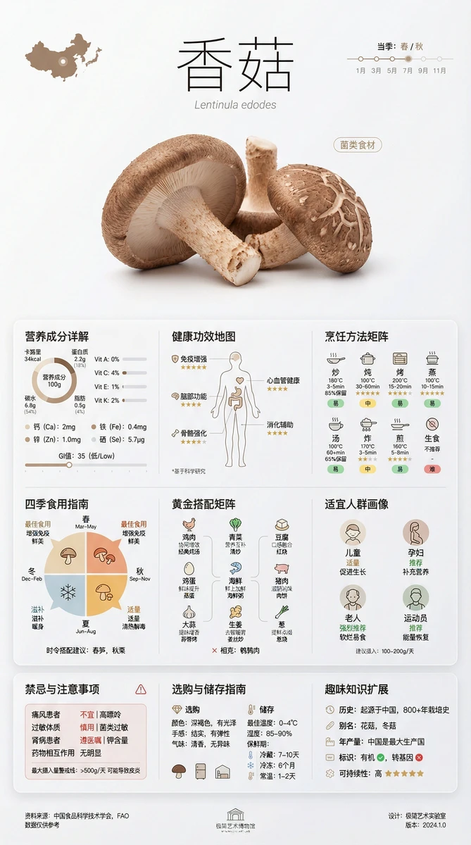
Đồ họa thông tin trứng tối giản
Minimalist Egg Infographic
Đồ họa thông tin trứng tối giản — khám phá tác phẩm được tạo bằng zhenzhen-image-nb-pro trên OpenZhenZhen, kèm prompt gốc và ví dụ tạo nội dung để tham khảo.
Prompt
Prompt tiếng Trung
一张极简艺术风格的[香菇]百科全书式信息卡片, 博物馆展品级别的设计品质,信息丰富但视觉克制 【整体构图 - 黄金分割布局】 - 画面比例:2:3竖版 或 3:4方形 - 三大视觉区域: * 顶部展示区(30%):大尺寸食材摄影 + 优雅标题排版 * 中部信息区(60%):多层次信息模块网格系统 * 底部注释区(10%):来源标注 + 设计细节 【顶部展示区 - 视觉焦点】 • 食材名称:超大字号,细线体/宋体,字间距加宽 • 拉丁学名:小字号斜体,灰色调 • 食材分类标签:极简胶囊形状标签 • 主图:去背景食材特写,工作室灯光,微阴影 • 原产地小型地图图示 • 当季时间轴线条图 【中部核心信息区 - 9大模块】 1、营养成分详解 - 圆环图:卡路里、蛋白质、碳水、脂肪占比 - 条形图:维生素A/C/E/K含量对比 - 矿物质微量元素列表(钙、铁、锌等) - 每100g营养数据精确标注 - GI值(升糖指数)可视化刻度尺 2、健康功效地图 - 人体轮廓图标注受益部位 - 5-6个主要功效图标化展示 - 功效强度等级标识(⭐⭐⭐⭐⭐) - 科学研究来源小标注 3、烹饪方法矩阵 - 8-10种烹饪方式图标网格 - 每种方式最佳温度/时间参数 - 营养保留率百分比显示 - 推荐指数星级评价 - 难度等级色彩标识 4、四季食用指南 - 圆形时间轮盘设计 - 标注最佳食用月份 - 不同季节功效变化说明 - 时令搭配建议 5、黄金搭配矩阵 - 9宫格搭配食材小图标 - 搭配理由简短标注 - 协同增效/相克警示 - 经典菜品配方示例 - 营养互补关系连线图 6、适宜人群画像 - 人群图标(儿童/孕妇/老人/运动员等) - 推荐程度色彩编码 - 特殊人群剂量建议 - 年龄段分类指南 7、禁忌与注意事项 - 红色警示框设计 - 不宜人群清晰列举 - 过敏源标识 - 药物相互作用提示 - 最大摄入量警戒线 8、选购与储存指南 - 新鲜度判断要点(颜色/手感/气味) - 品质等级划分图示 - 最佳储存温度/湿度数据 - 保鲜期时间轴 - 冷藏/冷冻/常温图标指南 9、趣味知识扩展 - 历史小故事(起源/传说) - 世界各地别名 - 年产量数据可视化 - 有机/转基因标识说明 - 可持续性评级 【视觉系统 - 极简艺术美学】 配色方案: - 主色:食材本身的自然色彩提取 - 辅色:大地色系(米白/燕麦/亚麻/石墨灰) - 强调色:克制使用1-2个高纯度色彩 - 背景:纯白或极浅灰(#FAFAFA) - 文字:深灰而非纯黑(#2C2C2C) 字体系统: - 标题:超细线条无衬线字体(Helvetica Neue UltraLight) - 正文:现代几何字体(DIN/Futura) - 数据:等宽字体(Roboto Mono) - 中文:思源黑体Light/方正兰亭黑 - 字号层级:6级字号系统(48/32/24/16/12/10pt) 图标系统: - 统一2pt线宽 - 圆角一致性(2px) - 24x24px网格对齐 - stroke而非fill优先 - 负空间利用 布局系统: - 12列网格系统 - 8pt基准网格对齐 - 模块间距:24pt/32pt/48pt - 边距:页边距48pt起 - 卡片圆角:8-12px - 微妙分割线:0.5pt,15%透明度 质感细节: - 微渐变背景(3-5%色值变化) - 柔和投影(0 4px 24px rgba(0,0,0,0.04)) - 磨砂玻璃效果(backdrop-filter: blur(20px)) - 元素间微妙高度差异(海拔系统) - 数据区域淡色填充(5%透明度) 【信息可视化原则】 - 数据图表:Edward Tufte简约数据墨水原则 - 去除非必要装饰 - 图表网格线极淡(10%透明度) - 数据点精确标注 - 趋势线平滑自然 【呼吸感营造】 - 模块间留白≥模块内容宽度的25% - 文字行间距1.6-1.8倍 - 段落间距≥2行高 - 图文组合留白法则 风格关键词: 瑞士国际主义平面设计、日本侘寂美学、包豪斯功能主义、 斯堪的纳维亚极简主义、Dieter Rams设计哲学、 无印良品视觉语言、Kinfolk杂志美学、 苹果产品设计语言、Google Material Design精髓
Prompt tiếng Anh
An encyclopedia-style information card for [egg] in a minimalist art style, with museum exhibit-level design quality that is rich in information but visually restrained. 【Overall Composition - Golden Ratio Layout】 Aspect Ratio: 2:3 vertical or 3:4 square Three Main Visual Areas: Top Display Area (30%): Large-scale food photography + Elegant title layout Central Information Area (60%): Multi-layered information module grid system Bottom Annotation Area (10%): Source notes + Design details 【Top Display Area - Visual Focus】 • Food Name: Extra-large font size, thin line type/Song typeface, widened letter spacing • Latin Name: Small font size italics, gray tone • Food Classification Tag: Minimalist capsule-shaped tag • Main Image: Background removed food close-up, studio lighting, subtle shadow • Origin Mini Map Icon • Seasonal Timeline Chart 【Central Core Information Area - 9 Major Modules】 1. Nutritional Breakdown Pie Chart: Calorie, protein, carbohydrate, fat ratio Bar Graph: Vitamin A/C/E/K content comparison Mineral Trace Element List (Calcium, Iron, Zinc, etc.) Precise nutritional data annotation per 100g GI Value (Glycemic Index) visual scale 2. Health Benefits Map Human outline highlighting benefited areas 5-6 main benefits icon display Benefit strength level marking (⭐⭐⭐⭐⭐) Scientific research source small annotations 3. Cooking Methods Matrix 8-10 cooking method icons grid Best temperature/time parameters for each method Nutrient retention rate percentage display Recommendation index star rating Difficulty level color coding 4. Seasonal Eating Guide Circular timeline wheel design Marking the best months to eat Description of seasonal efficacy changes Seasonal pairing suggestions 5. Golden Pairing Matrix 9-grid pairing ingredient icons Brief annotations on pairing reasons Synergistic enhancement/contraindication warnings Classic dish recipe examples Nutritional complementation relationship connection diagram 6. Suitable Population Profile Population icons (Children/Pregnant Women/Seniors/Athletes, etc.) Recommendation level color coding Special population dosage advice Age group classification guide 7. Contraindications and Precautions Red warning box design Clear listing of unsuitable populations Allergen identification Drug interaction tips Maximum intake warning line 8. Selection and Storage Guide Freshness judgment points (color/touch/smell) Quality grade division illustration Optimal storage temperature/humidity data Shelf life timeline Refrigerated/Frozen/Room Temperature icon guide 9. Fun Knowledge Expansion Historical anecdotes (origin/legend) Alternative names around the world Annual production data visualization Organic/GMO labeling explanation Sustainability rating 【Visual System - Minimalist Art Aesthetics】 Color Scheme: Primary Color: Natural colors extracted from the food itself Secondary Colors: Earth tones (Off-white/Oatmeal/Linen/Graphite Gray) Accent Colors: Restrained use of 1-2 high purity colors Background: Pure white or very light gray (#FAFAFA) Text: Dark gray rather than pure black (#2C2C2C) Font System: Titles: Ultra-thin sans-serif font (Helvetica Neue UltraLight) Body Text: Modern geometric fonts (DIN/Futura) Data: Monospaced font (Roboto Mono) Chinese: Source Han Sans Light/Fangzheng Lantinghei Font Size Hierarchy: 6-level font size system (48/32/24/16/12/10pt) Icon System: Uniform 2pt line width Consistent corner radius (2px) 24x24px grid alignment Stroke preferred over fill Utilization of negative space Layout System: 12-column grid system 8pt baseline grid alignment Module spacing: 24pt/32pt/48pt Margins: Page margins starting at 48pt Card rounded corners: 8-12px Subtle dividing lines: 0.5pt, 15% opacity Texture Details: Subtle gradient background (3-5% color value change) Soft shadow (0 4px 24px rgba(0,0,0,0.04)) Frosted glass effect (backdrop-filter: blur(20px)) Slight height differences between elements (altitude system) Light color fill in data areas (5% opacity) 【Information Visualization Principles】 Data Charts: Edward Tufte's minimalist data ink principle Removal of unnecessary decorations Extremely faint chart grid lines (10% opacity) Precise annotation of data points Smooth natural trend lines 【Breathing Space Creation】 White space between modules ≥ 25% of module content width Line spacing 1.6-1.8 times Paragraph spacing ≥ 2 line heights Image-text combination whitespace rule Style Keywords: Swiss International Typographic Style, Japanese Wabi-sabi aesthetics, Bauhaus functionalism, Scandinavian minimalism, Dieter Rams design philosophy, Muji visual language, Kinfolk magazine aesthetics, Apple product design language, Essence of Google Material Design
Chủ đề và phong cách
Xem thêm prompt hình ảnh và video · Tạo hình ảnh · Tạo video · Tạo trên canvas AI
Tác phẩm liên quan
- Thị trấn hồ Hallstatt
Thị trấn hồ Hallstatt — khám phá tác phẩm được tạo bằng seedream-v5-pro-t2i trên OpenZhenZhen, kèm prompt gốc và ví dụ tạo nội dung để tham khảo.
- Bình minh rừng mùa hè
Bình minh rừng mùa hè — khám phá tác phẩm được tạo bằng seedream-v5-pro-t2i trên OpenZhenZhen, kèm prompt gốc và ví dụ tạo nội dung để tham khảo.
- Walkman hoa xuân
Walkman hoa xuân — khám phá tác phẩm được tạo bằng seedream-v5-pro-t2i trên OpenZhenZhen, kèm prompt gốc và ví dụ tạo nội dung để tham khảo.
- Cò trắng lúc hoàng hôn
Cò trắng lúc hoàng hôn — khám phá tác phẩm được tạo bằng seedream-v5-pro-t2i trên OpenZhenZhen, kèm prompt gốc và ví dụ tạo nội dung để tham khảo.
- Gấu trên quả dâu
Gấu trên quả dâu — khám phá tác phẩm được tạo bằng seedream-v5-pro-t2i trên OpenZhenZhen, kèm prompt gốc và ví dụ tạo nội dung để tham khảo.
- Chim giữa muôn hoa
Chim giữa muôn hoa — khám phá tác phẩm được tạo bằng seedream-v5-flash-t2i trên OpenZhenZhen, kèm prompt gốc và ví dụ tạo nội dung để tham khảo.